Alan Metnick
About the Glass
The Glass pieces grew out of the Silkscreen Prints that I had been doing for years. It was easy to make the transition to glass because I use color in much the same way in both. I prefer rich and fully saturated colors, which can be created in both mediums. The Glass and the Silk-screens start as small, black and white, pen and ink drawings, usually about 4 inches by 6 inches in size. The drawings for the Glass pieces are then enlarged to the size that the final piece will be; approximately 20 inches by 30 inches. The choice of colors is made as the piece evolves. I don't pre-visualize the final piece. The glass is chosen, laid out, and the pattern drawn. It's then cut, by hand or electric saw, and the edges are ground down and foiled in preparation to being soldered. The piece is then put back together, much like a jigsaw puzzle. And like jigsaw puzzles, as I've grown more comfortable with the process I've created windows that use more and more pieces of glass. The last 3 windows have upwards of 400 individually cut pieces of glass. After the pieces are soldered together and the solder sanded down and cleansed, a black patina is applied to the solder to bring the piece back to the original vision that was created in the earlier black and white drawing, but now with all the colors added.
The subject matter for the Glass pieces comes from the same thought processes that created many of the Silkscreen Prints. These may include current international events, Israeli and Jewish events or references, and personal pieces referencing back to family. Occasionally there is some piece that is either commissioned or that grew out of a series of drawings that were done for a specific event. The drawing somehow got away from the original reason for doing it and wound up simply being a drawing that was asking to be made into a piece of glass.
The Desk Sconce pieces are examples of the jagged, sharp pointed line work I often use. The graphics for the sconces aren't suggesting anything in particular but came from the way I was using glass for the Kristalnacht Triptych. The sconces started as a project to create fifty different black and white pieces. At a certain point I couldn't resist trying some with color. The reason for the fifty black and white pieces is simply because I thought it would be a great exhibit, that would be fun to see. The sconces are each controlled by dimmers.
About the Serigraphs
The earliest print in this section, taken from a drawing of mine, dates from 1978. (It's the Mountains not the Sea that's Red-1978.) The drawing that led to the print was scribbled while attending a meeting to organize a school for my children. The drawing was on a torn piece of paper and I put it aside to pay attention to the meeting. Later when I got home, I looked at it again and thought that I should make a print of it. I had done a few drawings that I made prints of earlier, (Legs Diamond and Albert Anastasia- Godfather Portfolio, 1973), but this one referencing the realization I had while camping in the Sinai along the Red Sea a few years earlier had a different personal immediacy to it.
The subject matter for many years related to Israel's relations with Egypt, events at the United Nations, the Yom Kippur War, and thoughts about time spent in Israel. Over time, other subjects were included, such as events in Soweto or Sarajavo. Prints were also based on trips to Belize, Italy, and Corsica. Prints emerged from drawings that were done for my brother's sons Bar Mitzvah invitations. (David's Landscape-1988, In the Cleft of the Rock-1991, Beyond the Jordan-1995) These drawings were based on the portion of the Torah that would be read the morning of the Bar Mitzvah service.
Silk-screening allows for the saturated use of lush oil inks. The colors are deep and rich. They permeate the subsurface and present themselves as a tactile, visceral presence on the surface. Of all the mediums I've worked with silk-screening is the most sensuous. In many of the prints I used a split-font technique, that I usually refer to as Rainbowing. The method involves laying two or more different colored inks next to each other. As the inks are squeegeed and forced through the screen they begin to blend together and create a third color with a tonal gradation between them. A sky can thus go from a light blue at the bottom to a dark blue or purple at the top in a smooth transition. Also most of these prints have upwards of ten colors. Each color necessitated a different stencil, and a different screen. Each color had to be carefully kept in register to allow for the print to come together when the final black overprint (the original drawing) was printed on top of all the colors previously laid down.
The Portfolios
There are five screened Portfolios presented here. Each is assembled in boxed sets and presents a specific idea or interest that I had. My earliest Portfolios used photographs from newspapers, books and magazines. These were done before I began using my drawings as the prime source for the prints. There is also a Portfolio not presented here, (X-Rated-1973), that used pornographic images as subject matter. That too, utilized magazine photos. These portfolios are important to me beyond the subject matter because they represent the period when I began to develop some technique. I gave myself a different set of technical problems with each Portfolio. Reviewing them at the present they have managed to hold together thematically and aesthetically.
The Haggadah Portfolio (Min HaHaggadot- From the Haggadahs) was inspired by my desire to give all my aunts something to put on their walls in addition to what I was used to seeing when I visited them. I certainly couldn't give them work from the previous portfolios I did. The prints in this portfolio are based on work found in old Haggadahs. The Haggadah forms the prayer service for the Jewish Holiday of Passover. Traditionally, Haggadahs have been illustrated. This tradition goes back hundreds of years Originally the illustrations for this portfolio were done as monochromatic woodcuts or drawings. For me it was a simple matter of photographing these illustrations and then reproducing them, adding the colors where I wanted.
The Ten Prints Portfolio is about the Holocaust. The drawings were done over a painful thirty day period. I believe I was able to harness that pain and direct it to a subject matter that I have thought about almost daily since I first became aware of it. For many years I had wanted to do something in reference to the Holocaust but had held back because I feared that anything I would do, would only trivialize it. For the better part of four weeks I taught a workshop at a college in upstate New York. I would return to a small house I had rented at the end of teaching each day. It was January 1985, it was cold, it was the middle of winter, I was by myself and I drew. I didn't set out drawing about the Holocaust. That wasn't what was on my mind as I began doing the drawings. Rather it was my pain that was on my mind. Somehow that pain was transferred and directed towards these drawings. After the first few drawings I sensed that I had found a way to finally make a statement about a subject that had been eluding me for years. The last print in this series was not about the Holocaust per se. It was about the Ethiopian Jews and their final arrival in Israel. The movement from Ethiopia to Israel had recently taken place and it seemed to both relate to what I had been drawing and to hint towards better times, like Trees growing out of Ashes. When the drawings were done, I realized what I had finally done. I wanted to present them as a Portfolio. I had read many of Elie Weisels books and was familiar with his courageous honestly and forthrightness. I contacted him, sent him a set of slides, and sought his permission to quote from his writings and speeches. I was honored when he allowed me to do that. This Portfolio contains three excerpts from Mr. Weisel .
The Unfinished Short Stories Portfolio is based on the idea that all my drawings are about something. As obvious as this would seem one could look at a drawing and easily conclude it it's not about anything. I'm not making any grandiose, earth-shaking statements. Rather these are simply what I was thinking about when I made the drawings that became the prints in this series. If I had to put write down what I was thinking about these are the words. These are the beginnings of thoughts and stories. When I ran out of room on the piece of board I was writing on, the story just ended, it was left unfinished.
About the Crayon Drawings
This series of drawings were done in 1987 and 1988. They were a fairly direct response to loss and dislocation. I had just moved out of the house that divorce arrangements dictated I sell. And it was sold. It was the house that three of my children had been raised in. It was the house that my studio was in. In spite of the presence of so many conflicting memories and experiences I didn't want to leave the house.
These drawings were done using Swiss Crayons (Caron D'Ache), and American Crayolas. The crayons were applied with great pressure. Hard edges were maintained by the use of masking tape. The masking tape would either act as a stencil or a shield, sometimes both. I would draw until my fingers hurt. That's what I remember. Sometimes I would have to wait two or three days before I could use the crayons again.
About the Oils and Acrylic Paintings
The ideas in the Oils are similar to the ideas in the Screen-prints. The Oils began in the 1970s, before I started the Pen and Ink Drawings. Again, Israel and Jewish Holidays provided the impetus for these paintings. The four Acrylics were done in 1992-93. These are paintings of four, old, industrial buildings in the Olneyville section of Providence, Rhode Island. These are buildings that I saw or worked in daily.
Both the Oils and the Acrylics were done using very fine brushes. Paint was often laid down slowly in a singular line. The next line would have a tiny dab of pigment added to the same base as the previous line, so as to allow the paint to slowly gradate in the direction I wanted to send it. It would take many hours to do a few square inches. When the Acrylics were done and dry I would then use a Rapidograph Pen to draw in the brickwork. This would take days. It was really nuts. Doing four of these was enough. Fortunately I stumbled onto Oil Sticks.
About the Oil Sticks
Oil Sticks are like a jumbo crayon The experience of using them was 180 degrees from the way I was painting. They are used like crayons. After taking months to complete a painting, all the while bent over the canvas with tiny four- ought (0000) paint brushes, slowly applying thin lines of paint, one at a time and blending them into the line that proceeded the line I was painting, the change to Oil Sticks was incredibly liberating. I began to work with larger canvas boards and to work much more rapidly. It was closer to the way I had worked with the crayons years earlier. Control over the oil sticks was different. They were much messier and being oil they required time to dry and it was difficult if not impossible to get the hard edge that I had maintained with the crayons. They were very exciting to work with; -the colors were deep, full, and luscious. The spontaneity, which I was craving after the Acrylics, was being satisfied. They also required me to work larger to get any sense of detail. In fact, they required me to compose the work as two, three, and four panel creations.
I went back to the Mill Buildings in the West End of Providence for subject matter. These are building that date mostly from the late 19th century. They exhibit wonderful brickwork. They were built at a time that building crafts merged with cheap immigrant labor. Brickwork and stonework like that no longer is done in this country. The Oil Sticks do not capture the intricacy of the fine brickwork. It's impossible to use the Oil Sticks for that. What I was drawn to however was the size of the buildings and the rows of arched windows and repeated shapes. The graphics within the overall mass was what I was attracted to. The work expressed an understanding between the demands and limitations of the Oil Sticks and what I wanted to talk about. I moved pretty easily from one piece to the next. I would do these late at night in my basement at home. I remember being energized, however tired I was when I began, and having to put the brakes on about 1:30 or 2:00 in the morning because I had to get some sleep to be able to go to work in a few hours.
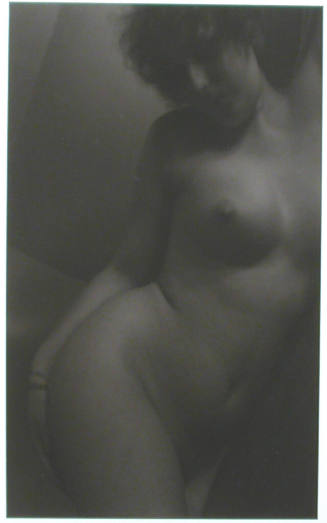
About the Photographs
This is what I moved from Chicago to Providence to do; to first study Photography and then to do it. It's now been thirty-five years. Although there are missing years in the prints, because of the manner in which I prioritize my printing, there are no gaps in the shooting. Unlike the other mediums that I have used, I have been most faithful to the camera in regards to continuity and use. For the most part I have used a small format, 35 mm., Leica M2, camera all these years. My film preference has been Tri-X-Black and White. I print on 11" x 14" warm tone papers, and then tone the prints further with Brown Toners or Poly Toners.
I don't consider myself a Documentary Photographer, but the photographs I have taken are in reality documents. Maybe, I resist the title because I have an aversion to being pigeonholed and labeled. It's limiting, it misses the point, and it's always wrong. And I'm not comfortable with preconceptions of who or what I am. Look at and hopefully enjoy the pictures. I did when I took them, when I developed them and when I printed them.
http://www.alanmetnick.com/Default.aspx?AspxAutoDetectCookieSupport=1